Process #1
How to get a Block Card in a simple 3 steps
Designed to work better together erat velit eget hac nulla nullam et id praesent nisi ornare risus risus consequat nunc nisl pellentesque diam neque.
Sign up for a free account
Apply online on block website and fill the form by telling us your name, address, date of birth.
Fill in your details
Get started on block or log into the mobile app. Bank account to transfer money to your debit card.
Start converting!
Set up direct deposit or connect your current bank account to transfer money to your debit card.
<!--Get block card start-->
<section class="my-xl-7 py-5">
    <div class="container">
        <div class="row">
            <div class="col-lg-5 col-md-12">
                <div class="mb-xl-7 mb-5">
                    <h2 class="mb-3">
                        How to get a Block Card in a
                        <span class="text-primary">simple 3 steps</span>
                    </h2>
                    <p class="mb-0">
                        Designed to work better together erat velit eget hac
                        nulla nullam et id praesent nisi ornare risus risus
                        consequat nunc nisl pellentesque diam neque.
                    </p>
                </div>
            </div>
        </div>
        <div class="table-responsive-xl">
            <div class="row flex-nowrap pb-4 pb-lg-0 me-5 me-lg-0">
                <div class="col-lg-4 col-md-6 col-12">
                    <div class="p-xl-5">
                        <div
                            class="d-flex align-items-center justify-content-between mb-5">
                            <div
                                class="icon-xl icon-shape rounded-circle bg-primary border border-primary-subtle border-4 text-white-stable fw-semibold fs-3">
                                1</div>
                            <span>
                                <svg xmlns="http://www.w3.org/2000/svg"
                                    width="32" height="32"
                                    fill="currentColor"
                                    class="bi bi-arrow-right text-body-tertiary"
                                    viewBox="0 0 16 16">
                                    <path fill-rule="evenodd"
                                        d="M1 8a.5.5 0 0 1 .5-.5h11.793l-3.147-3.146a.5.5 0 0 1 .708-.708l4 4a.5.5 0 0 1 0 .708l-4 4a.5.5 0 0 1-.708-.708L13.293 8.5H1.5A.5.5 0 0 1 1 8z" />
                                </svg>
                            </span>
                        </div>

                        <h3 class="h4">Sign up for a free account</h3>
                        <p class="mb-0">Apply online on block website and
                            fill the form by telling us your name, address,
                            date of birth.</p>
                    </div>
                </div>
                <div class="col-lg-4 col-md-6 col-12">
                    <div class="p-xl-5">
                        <div
                            class="d-flex align-items-center justify-content-between mb-5">
                            <div
                                class="icon-xl icon-shape rounded-circle bg-primary border border-primary-subtle border-4 text-white-stable fw-semibold fs-3">
                                2</div>
                            <span>
                                <svg xmlns="http://www.w3.org/2000/svg"
                                    width="32" height="32"
                                    fill="currentColor"
                                    class="bi bi-arrow-right text-body-tertiary"
                                    viewBox="0 0 16 16">
                                    <path fill-rule="evenodd"
                                        d="M1 8a.5.5 0 0 1 .5-.5h11.793l-3.147-3.146a.5.5 0 0 1 .708-.708l4 4a.5.5 0 0 1 0 .708l-4 4a.5.5 0 0 1-.708-.708L13.293 8.5H1.5A.5.5 0 0 1 1 8z" />
                                </svg>
                            </span>
                        </div>

                        <h3 class="h4">Fill in your details</h3>
                        <p class="mb-0">Get started on block or log into the
                            mobile app. Bank account to transfer money to
                            your debit card.</p>
                    </div>
                </div>
                <div class="col-lg-4 col-md-6 col-12">
                    <div class="p-xl-5">
                        <div
                            class="d-flex align-items-center justify-content-between mb-5">
                            <div
                                class="icon-xl icon-shape rounded-circle bg-primary border border-primary-subtle border-4 text-white-stable fw-semibold fs-3">
                                3</div>
                            <span>
                                <svg xmlns="http://www.w3.org/2000/svg"
                                    width="24" height="24"
                                    fill="currentColor"
                                    class="bi bi-check-circle-fill text-success"
                                    viewBox="0 0 16 16">
                                    <path
                                        d="M16 8A8 8 0 1 1 0 8a8 8 0 0 1 16 0zm-3.97-3.03a.75.75 0 0 0-1.08.022L7.477 9.417 5.384 7.323a.75.75 0 0 0-1.06 1.06L6.97 11.03a.75.75 0 0 0 1.079-.02l3.992-4.99a.75.75 0 0 0-.01-1.05z" />
                                </svg>
                            </span>
                        </div>

                        <h3 class="h4">Start converting!</h3>
                        <p class="mb-0">Set up direct deposit or connect
                            your current bank account to transfer money to
                            your debit card.</p>
                    </div>
                </div>
            </div>
        </div>
        <div class="row">
            <div class="col-lg-12">
                <div class="text-center my-5">
                    <a href="#!" class="btn btn-outline-primary">Open an
                        Account</a>
                </div>
            </div>
        </div>
    </div>
</section>
<!--Get block card end-->
Process #2
Our website design process explained
Discover
A strategic setup is crucial to success. simple lorem ipsum.
Build
Each research questionnaire is tailor-made.
Deliver
Sharing insights intelligently ensures research resonates.
<!--process-->
<section class="bg-light py-lg-10 py-5">
    <div class="container">
        <div class="row">
            <div class="col-md-12">
                <div class="text-center mb-lg-7 mb-5">
                    <small
                        class="text-uppercase text-primary ls-md fw-bold">our
                        process</small>
                    <h2 class="mt-2 mb-0">Our website design process
                        explained</h2>
                </div>
            </div>
        </div>
        <div class="row">
            <div class="col-lg-10 offset-lg-1 col-md-12">
                <div class="row">
                    <div class="col-md-4">
                        <div
                            class="text-center mb-6 mb-lg-0 mx-4 mx-md-auto">
                            <div
                                class="icon-shape icon-md bg-primary bg-opacity-10 text-primary rounded-circle fs-4 p-2 mb-lg-5 mb-3 fw-bold">
                                1</div>

                            <h4>Discover</h4>
                            <p class="mb-0">A strategic setup is crucial to
                                success. simple lorem ipsum.</p>
                        </div>
                    </div>
                    <div class="col-md-4">
                        <div
                            class="text-center mb-6 mb-lg-0 mx-4 mx-md-auto">
                            <div
                                class="icon-shape icon-md bg-primary bg-opacity-10 text-primary rounded-circle fs-4 p-2 mb-lg-5 mb-3 fw-bold">
                                2</div>

                            <h4>Build</h4>
                            <p class="mb-0 mx-lg-5">Each research
                                questionnaire is tailor-made.</p>
                        </div>
                    </div>
                    <div class="col-md-4">
                        <div
                            class="text-center mb-6 mb-lg-0 mx-4 mx-md-auto">
                            <div
                                class="icon-shape icon-md bg-primary bg-opacity-10 text-primary rounded-circle fs-4 p-2 mb-lg-5 mb-3 fw-bold">
                                3</div>

                            <h4>Deliver</h4>
                            <p class="mb-0">Sharing insights intelligently
                                ensures research resonates.</p>
                        </div>
                    </div>
                </div>
            </div>
        </div>
    </div>
</section>
<!--process-->
Process #3
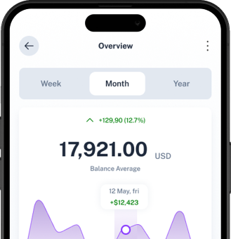
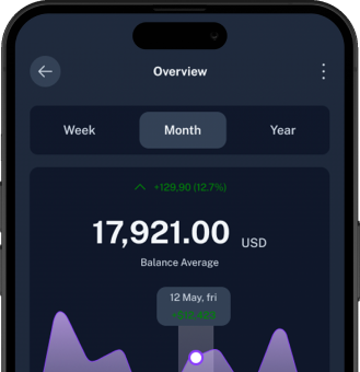
Get Started In Just 3 simple Steps.
Three simple steps to unlock the power of Block and revolutionise your banking experience.
Scan & Download
Get the app and create your account.
Connect Accounts
Securely connect your bank accounts.
Track and Improve
Start managing your finances effortlessly.
<!--Steps-->
  <section class="py-xl-9 py-6">
     <div class="container">
        <div class="row justify-content-center">
           <div class="col-lg-10 col-12">
              <div class="row align-items-center gy-5">
                 <div class="col-lg-5 col-12">
                    <div class="d-flex flex-column gap-4 mb-5 mb-lg-9 position-relative">
                       <div>
                          <span class="badge bg-white text-primary border border-light-subtle rounded-pill text-uppercase fw-semibold py-2 px-3 small ls-md">
                             How it works
                          </span>
                       </div>
                       <div class="d-flex flex-column gap-2 mb-8">
                          <h2 class="mb-0 display-6">Get Started In Just 3 simple Steps.</h2>
                          <p class="mb-0">Three simple steps to unlock the power of Block and revolutionise your banking experience.</p>
                       </div>
                       <!-- Add Navigation -->
                       <div class="swiper-navigation position-absolute bottom-0">
                          <div class="swiper-button-prev me-7"></div>
                          <div class="swiper-button-next ms-7"></div>
                       </div>
                    </div>
                 </div>
                 <div class="offset-lg-1 col-lg-6 bg-light rounded-4">
                    <div
                       class="swiper-container swiper"
                       id="swiper-1"
                       data-pagination-type=""
                       data-speed="400"
                       data-space-between="100"
                       data-pagination="false"
                       data-navigation="true"
                       data-autoplay="false"
                       data-autoplay-delay="3000"
                       data-breakpoints='{"480": {"slidesPerView": 1}, "768": {"slidesPerView": 1}, "1024": {"slidesPerView": 2}, "1200": {"slidesPerView": 1}}'>
                       <div class="swiper-wrapper">
                          <div class="swiper-slide">
                             <div class="px-6 pt-6 text-center">
 <span class="badge text-bg-dark rounded-pill px-3 py-3 fs-6">Step - 1</span>
 <div class="mt-3 mb-4">
    <h3 class="mb-0">Scan & Download</h3>
    <p class="mb-0">Get the app and create your account.</p>
 </div>
 <div class="d-flex justify-content-center">
    <img src="../assets/images/mobile-app/step-img-light.png" alt="mobile front" class="img-fluid dark-mode-none" />
    <img src="../assets/images/mobile-app/step-img-dark.png" alt="mobile front" class="img-fluid d-none dark-mode-block" />
 </div>
                             </div>
                          </div>
                          <div class="swiper-slide">
                             <div class="text-center px-6 pt-6">
 <span class="badge text-bg-dark rounded-pill px-3 py-3 fs-6">Step - 2</span>
 <div class="mt-3 mb-4">
    <h3 class="mb-0">Connect Accounts</h3>
    <p class="mb-0">Securely connect your bank accounts.</p>
 </div>
 <div class="d-flex justify-content-center">
    <img src="../assets/images/mobile-app/step-img-light.png" alt="mobile front" class="img-fluid dark-mode-none" />
    <img src="../assets/images/mobile-app/step-img-dark.png" alt="mobile front" class="img-fluid d-none dark-mode-block" />
 </div>
                             </div>
                          </div>
                          <div class="swiper-slide">
                             <div class="text-center px-6 pt-6">
 <span class="badge text-bg-dark rounded-pill px-3 py-3 fs-6">Step - 3</span>
 <div class="mt-3 mb-4">
    <h3 class="mb-0">Track and Improve</h3>
    <p class="mb-0">Start managing your finances effortlessly.</p>
 </div>
 <div class="d-flex justify-content-center">
    <img src="../assets/images/mobile-app/step-img-light.png" alt="mobile front" class="img-fluid dark-mode-none" />
    <img src="../assets/images/mobile-app/step-img-dark.png" alt="mobile front" class="img-fluid d-none dark-mode-block" />
 </div>
                             </div>
                          </div>
                       </div>
                       <!-- Add Pagination -->
                       <div class="swiper-pagination"></div>
                    </div>
                 </div>
              </div>
           </div>
        </div>
     </div>
  </section>
<!--Steps-->
Process #4
How It Works
Get started with our AI tools in just a few simple steps
Sign Up & Choose a Plan
Get started in minutes by selecting the plan that fits your needs.
Access AI Tools & Customize
Use our AI-driven tools to create content, analyze data, and more.
Generate & Download Results
Download high-quality outputs for your projects effortlessly.
<section class="py-xl-9 py-lg-7 py-5 bg-gray-900" data-bs-theme="dark">
<div class="container">
<div class="row">
<div class="col-12">
<div class="text-center mb-xl-7 mb-5 d-flex flex-column gap-2">
<h2 class="mb-0"><span class="gradient-text">How It Works</span></h2>
<p class="mb-0 lead">Get started with our AI tools in just a few simple steps</p>
</div>
</div>
</div>
<div class="row gy-5 gy-md-0 process-step gx-6">
<div class="col-lg-4 col-md-6 col-12">
<div class="d-flex flex-column gap-6 p-xxl-6 p-md-4 text-center">
<div class="line">
<div class="icon-shape icon-md text-dark fw-semibold fs-4 mx-auto border-gradient-mix-color">1</div>
</div>
<div class="d-flex flex-column gap-2">
<h3 class="fs-4 mb-0">Sign Up & Choose a Plan</h3>
<p class="mb-0">Get started in minutes by selecting the plan that fits your needs.</p>
</div>
</div>
</div>
<div class="col-lg-4 col-md-6 col-12">
<div class="d-flex flex-column gap-6 p-xxl-6 p-md-4 text-center">
<div class="line">
<div class="icon-shape icon-md text-dark fw-semibold fs-4 mx-auto border-gradient-mix-color">2</div>
</div>
<div class="d-flex flex-column gap-2">
<h3 class="fs-4 mb-0">Access AI Tools & Customize</h3>
<p class="mb-0">Use our AI-driven tools to create content, analyze data, and more.</p>
</div>
</div>
</div>
<div class="col-lg-4 col-md-6 col-12">
<div class="d-flex flex-column gap-6 p-xxl-6 p-md-4 text-center">
<div class="line">
<div class="icon-shape icon-md text-dark fw-semibold fs-4 mx-auto border-gradient-mix-color">3</div>
</div>
<div class="d-flex flex-column gap-2">
<h3 class="fs-4 mb-0">Generate & Download Results</h3>
<p class="mb-0">Download high-quality outputs for your projects effortlessly.</p>
</div>
</div>
</div>
</div>
</div>
</section>